-
The Full-Stack Campaign, Part I: The First Map – How the Browser Shapes the World
Every campaign begins with a map. Not a perfect one or a complete one, but something reliable enough to take the first step without walking straight off a cliff. That is exactly how I learned to approach the browser, not as a mystery box, but as terrain that can be studied, understood, and navigated with intent. When I first started learning web development, I believed the map was the code itself. HTML, CSS, and JavaScript felt like the ground beneath my feet. If I could write them well, I assumed the world would simply appear the way I imagined it. It took some frustrating and very humbling moments to realize…
-
The CSS Codex, Part III: Why CSS Feels Like Wild Magic
When I first began working with CSS, it did not feel like engineering. It felt like sorcery. I would change one property and three unrelated elements would shift. I would adjust a margin and a layout would collapse like a poorly balanced tower shield. I would confidently add a rule, refresh the page, and watch the browser ignore me with serene indifference. CSS did not behave like the deterministic logic of a programming language. It felt volatile. Chaotic. Unpredictable. It felt like wild magic. But wild magic in Dungeons and Dragons is not truly random. It is governed by tables, triggers, and hidden mechanics. It only appears chaotic to those…
-
The Rogue Who Could Not Tab: Fixing Keyboard Navigation
I have shipped features that looked beautiful and worked perfectly with a mouse, only to discover later that they were nearly impossible to use with a keyboard. It felt like building a grand stone keep with polished banners and glowing torches, then realizing I forgot to add doors. Users could admire it from afar, but they could not enter. Fixing keyboard navigation after the fact is humbling. It forces me to examine every assumption I made about interaction. It also reminds me that accessibility is not an optional side quest. It is part of the main campaign. When I return to an existing codebase to repair keyboard support, I approach…
-
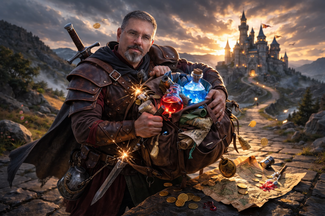
One More Potion in the Pack: The Performance Cost of One Extra Image
There is a moment in every campaign when someone insists it is only one more item. One more rope. One more potion. One more mysterious glowing artifact that absolutely will not awaken something ancient. Then the party slows down. Movement decreases. Initiative suffers. The dragon closes the distance. I used to treat images that way in my projects. It is only one more image. It will enhance the design. It will elevate the aesthetic. What could it possibly cost. More than I expected. I learned this while refining one of my portfolio builds. The layout was clean. The typography was intentional. The JavaScript was efficient. Performance metrics were solid. Then…